
Brand Development
Forging the Identity
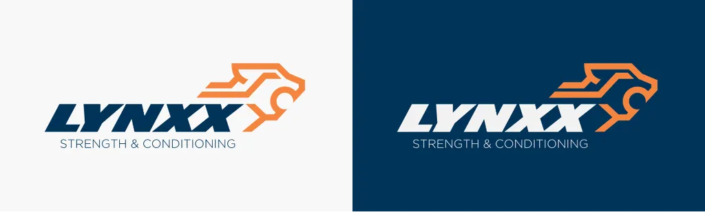
The brand development process centred around distilling the company's essence into a visual form. This meant creating an identity that was not only recognisable but also deeply reflective of the company's values and aspirations.
- Brand Voice & Identity: Forged a visual identity that communicates strength, precision, and dynamism—critical traits of the company's brand voice.
- Symbolism & Typography: Selected design elements that symbolise progression—like the lynx—paired with type that conveys movement and energy.
- Colour Theory Application: Applied colour theory to choose a palette that evokes vitality, using orange signifying energy and enthusiasm, set against a deep, grounded backdrop to denote strength.
Carefully crafted branding ensures the company's ethos is not just told but felt and experienced.
Wireframing / Protoyping
Modelling the Interface
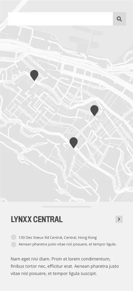
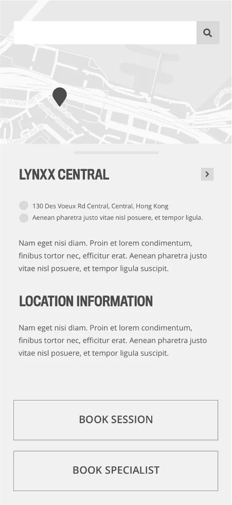
Wireframes shaped the app's structure, essential for testing and iterating on the user experience.
- Functional Layout: Concentrated on creating a layout streamlining the user's path to booking and location services.
- Feature Optimisation: Made calculated decisions on feature inclusions, like removing user profiles to expedite the journey and reduce barriers to service access.
Strategic simplification in the app's wireframes eliminates clutter, leading to engagement and conversion.
App Design
Creating customer touchpoints
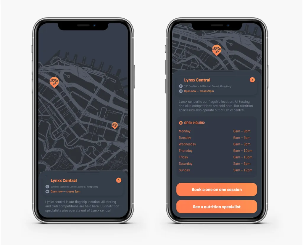
In designing the Lynxx app, functional aesthetics were critical. The app not only had to look good but also provide a seamless experience from the first touchpoint.
- User-Centered UI: Developed an interface that puts the user journey at the forefront, minimising friction and enhancing the overall experience.
- Navigational Clarity: Designed the navigation to be intuitive, employing colour and contrast to guide users effortlessly through their fitness journey.
The UI doesn't just serve the user—it should anticipate their next step, making interaction second nature.
Throughout the brand and app development process, the focus was to construct a cohesive experience where the company's commitment to progression is evident at every touchpoint. By designing a visual language and digital interface that align closely with the company's values, the result is not just a product—it's a platform that propels the company forward in the competitive fitness industry landscape.