UI app design
Enhanced customer access
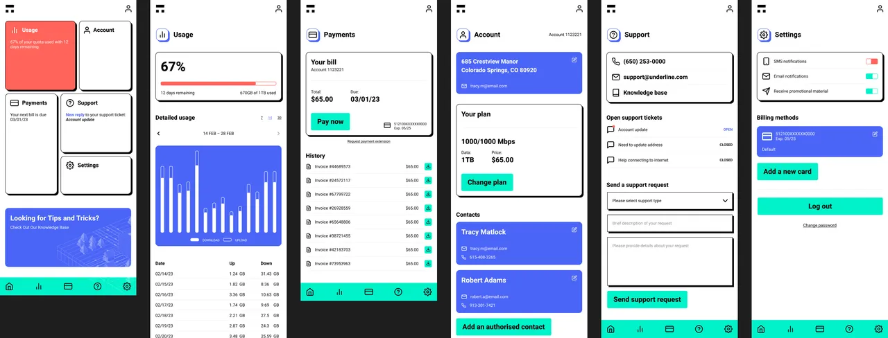
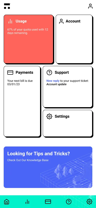
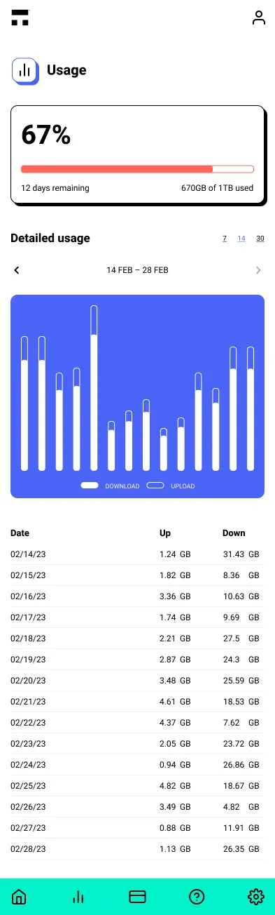
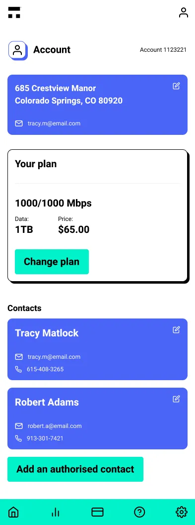
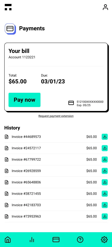
For a niche internet service provider in the US, this project required an app to present customer account data and insights. The aim was to evolve basic wireframes and guidelines into a user-friendly interface, making interacting and accessing vital information easier.
- Streamlined account visibility: Easier access to billing, support, and account details.
- Intuitive navigation: Logical paths for quick access to key information.
Clear, understandable interaction.
Established brand style
Growth within set parameters
This project also entailed integrating the new app design with the company's established visual identity. This integration was crucial to maintaining a consistent user experience across the brand's digital presence. The approach carefully blends existing visual elements with newly introduced components. This strategy ensured the app remained visually cohesive with the brand's identity while introducing fresh and functional design elements.
- Consistent branding: UI design adaptation within existing brand boundaries ensured a cohesive experience.
- Strategic visual growth: In line with the brand's colour scheme and guidelines, new design elements improved app functionality while maintaining recognisability.

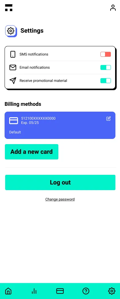
Incorporating new UI components, improving functionality, and upholding brand identity.
The approach produced an app that balanced functionality with visual appeal. This alignment with the brand's identity met and exceeded client expectations. It demonstrates the significance of cohesive design strategies in enhancing user engagement and strengthening brand presence in the digital landscape.